One of the problems with processing CSV data using a Yahoo pipe – as described in Filtering Guardian Data Blog/Google Spreadsheet Data With Yahoo! Pipes – is that the RSS output of the pipe is not very well formed. It’s fine for outputting as CSV, or even JSON, but it’s not so hot as RSS.
So in this post, I’ll show you how to get a proper RSS feed out, with a meaningful title and sensible description for each item, and as an added bonus, a chart image generated from the CSV data using the Google Chart API.
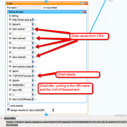
So to start, let’s grab some CSV (I’m using the Guardian Data Store RAE 2008 data on Google Spreadhseets again), name the columns ourselves, and generate a sensible title for each feed item:

For the item description data, I’m going to create a simple listing of the data values:

(Don’t worry about where the chartURI came from just for the moment…)
What this loop element does is create a string for each item in the feed, and then output is as the description element for the corresponding item. The data elements within each item are displayed in a faux table within the description. (Note that I could have constructed a proper HTML data table had I wanted to…)
So here’s description (without the chartURI image element shown):
![]()
That is:

So that’s part 1 – constructing title and description elements for each feed item, where a feed item is derived from a CSV row.
Now let’s see how to create a chart image from the data using the Google Chart API.
The Google Charts API provides a RESTful API to a chart generating service – which is to say: you can give it a URI containing some data and specifying a chart type, and it will give you an image back in return, with your data graphed appropriately (see also: RESTful Image Generation – When Text Just Won’t Do).
So for example, here’s a pie chart:
And here’s its URI:
http://chart.apis.google.com/chart?cht=p&chs=450×300&chd=t:10,10,45,35,0&chl=1*|2*|3*|4*|unclassifed&chtt=RAE2008%20(Open%20University%20)%20-%20Art%20and%20Design
So using our EYES, we can see different things in that URI:
- the domain that serves the image: http://chart.apis.google.com/chart?
- the chart type: cht=p
- the chart size/dimensions: &chs=450×300
- the chart data: &chd=t:10,10,45,35,0
- the chart labels: &chl=1*|2*|3*|4*|unclassifed
- and the chart title:
&chtt=RAE2008%20(Open%20University%20)%20-%20Art%20and%20Design
And now we can construct URIs of that form within the pipe:
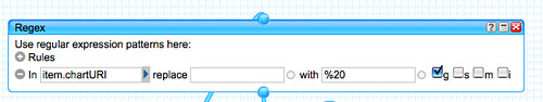
Now I do a couple o fbits of tidying up – the chartURI string just needs making into a nice URI – replace the spaces with their ASCII code representation, for example:
As we currently have no link element defined for the feed items, lets use the chart URI:

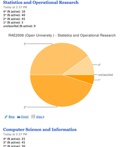
So there we have it – and RSS feed from the pipe containing the “tabulated” data from each CSV row, and a pie chart to display it:
From the pipe RSS feed URI:
http://pipes.yahoo.com/pipes/pipe.run?_id=FiRDFkIO3hG2u0k_Pm7D0g&_render=rss&hei=Open
you’ll notice the search term for the particular HEI you’re interested in, which means you should be easily able to hack it to give the appropriate feed for your own HEI:-)

Impressive!! Thanks a lot for your blog and all your “how to” around yahoopipes and data viz..
We are starting to see tomorrow’s web.
Just what I needed!
That’s a nice combination of data and visual. If you want more sophisticated charts, there is also chart.inetsoft.com.